
Visualize and understand response time and risk profiles instantly
Maps and Stats for Understanding Coverage
ResponseVision gives you compelling map and statistical evidence for making – and advocating for – effective decisions, with minimal expense, startup effort, or technical expertise. Get answers to some of the most common deployment questions with almost no effort, such as:
- What’s our risk profile?
- How long does it take to get to this proposed new neighborhood from the nearest fire station?
- How many of a given building type is within X miles of the nearest station?
- What percentage of our territory can be accessed by a first due assignment within 12 minutes?
- How does this all change if we move or add stations?
ResponseVision for Community Risk Reduction Programs
When planning for your city’s future, make informed decisions with ResponseVision. Evaluate risk factors and performance metrics, fix problems in coverage gaps, assess risk, target hazards, evaluate response time, identify coverage to high density residential properties, and many other building types.
How ResponseVision Works
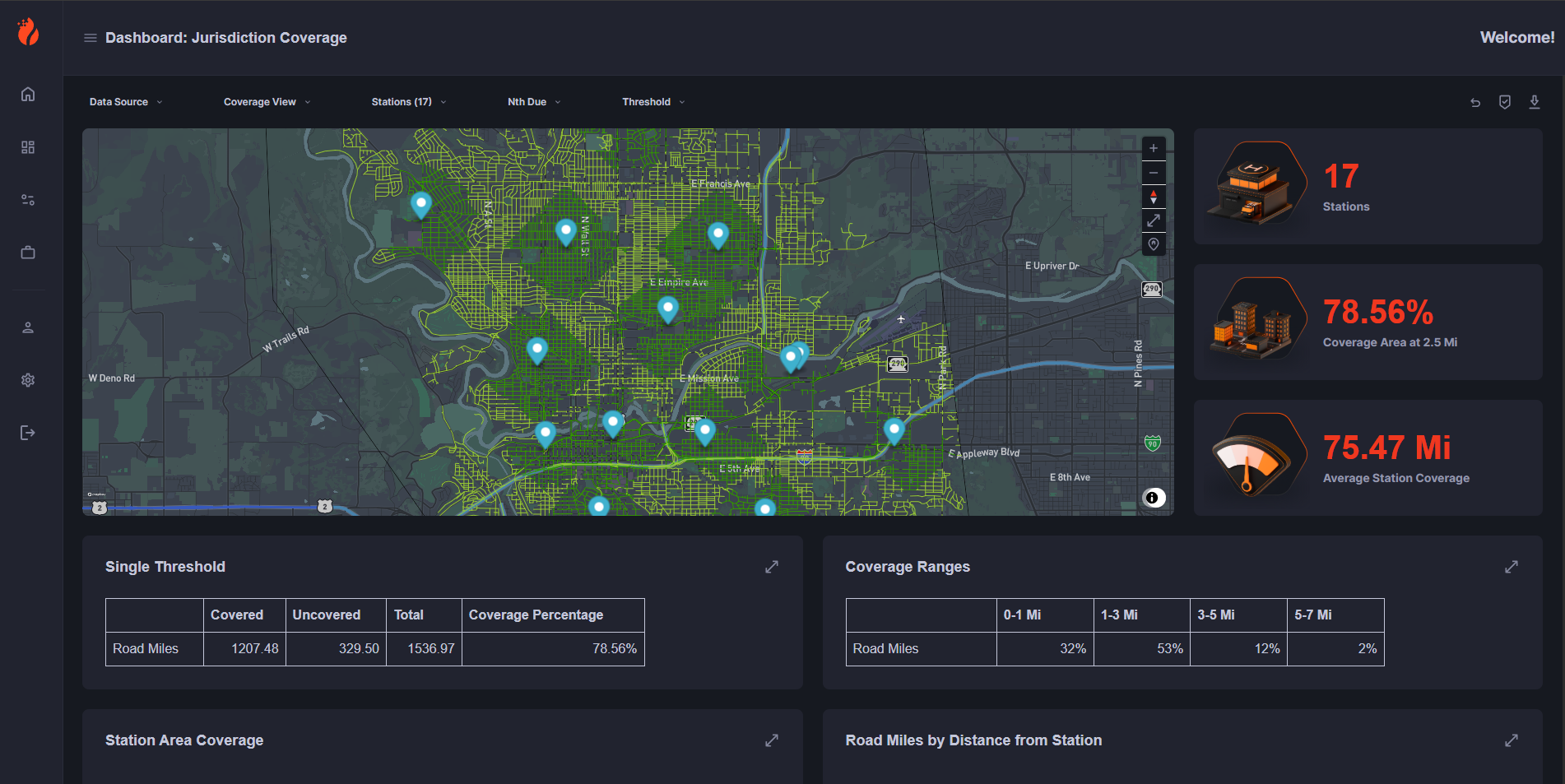
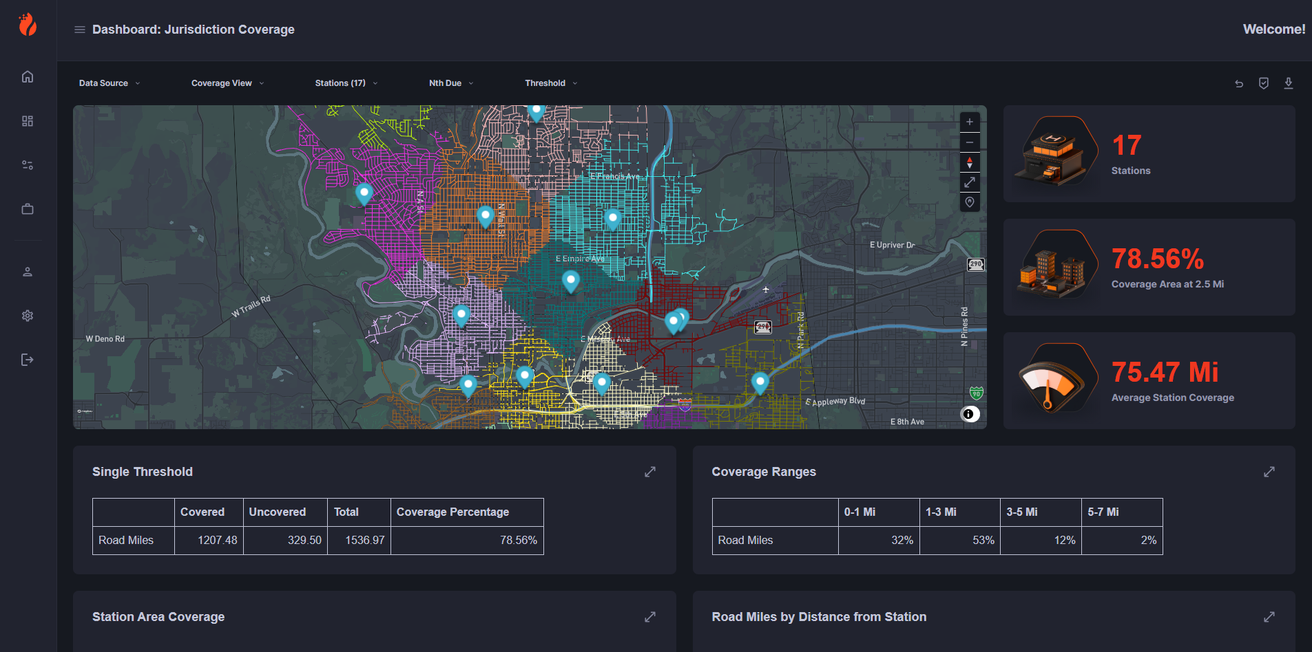
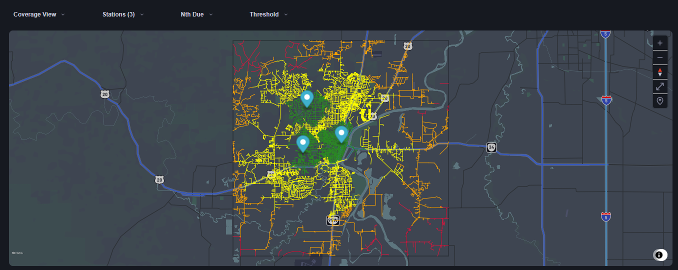
ReponseVision builds a lightweight model of your region and active stations with vibrant visual data. It allows you to view service coverage and gaps based on a distance or time threshold, and view this data on a map that draws over your road network indicating which streets are covered and by which station.
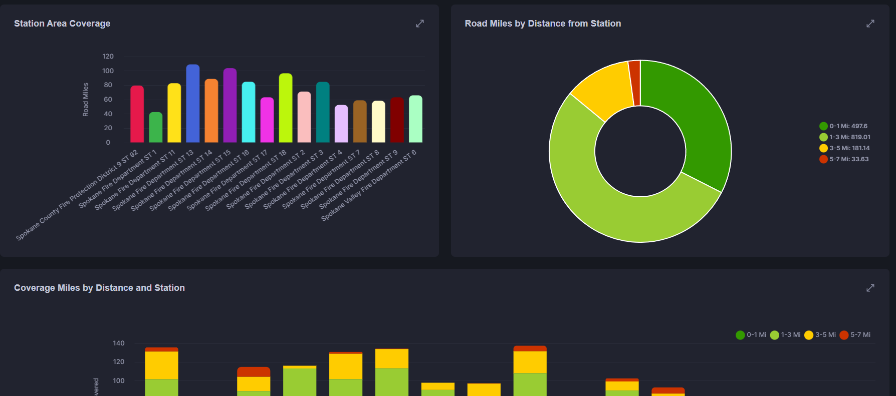
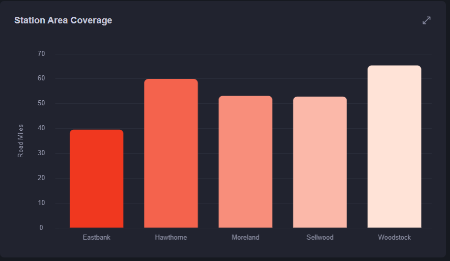
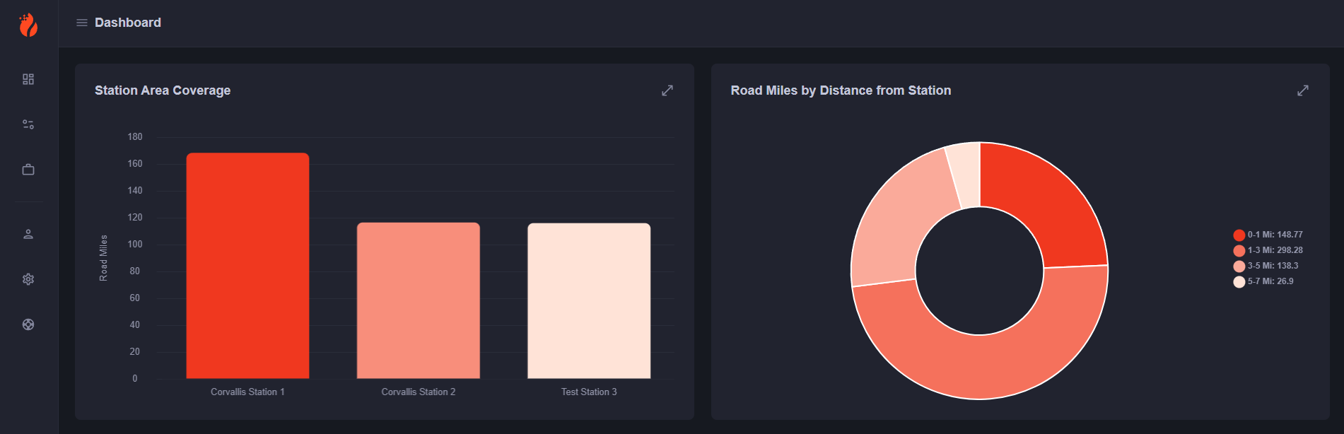
A summary with charts and statistics will also break this data down into distances from the nearest station, and how much of the jurisdiction a given station covers compared to other stations.
When using ResponseVision, feel free to get creative and add, move, and filter stations to get a feel for potential service impact. Our charts break down the service area by distance from each station, and allow you to compare station regional responsibility.